Designing Trust: How We Rebranded a Fintech Tool for Black & Brown College Students
Kinly was a fintech app created to help Black and Brown college students gain financial literacy and bank responsibly. Its mission was bold and urgent: to close the racial wealth gap by empowering the next generation with better tools, habits, and systems. It was acquired by Greenwood bank in April 2023.
I joined Kinly as a Lead Product Designer, where most of my work focused on core product and UX design. But this branding project stood out — not just because of the impact it had, but because of what it taught me about aligning design with purpose.
That work paid off. In 2023, Kinly was acquired by Greenwood Bank — a key moment in its journey toward serving even more users at scale.
That’s why I wanted to share this case study.
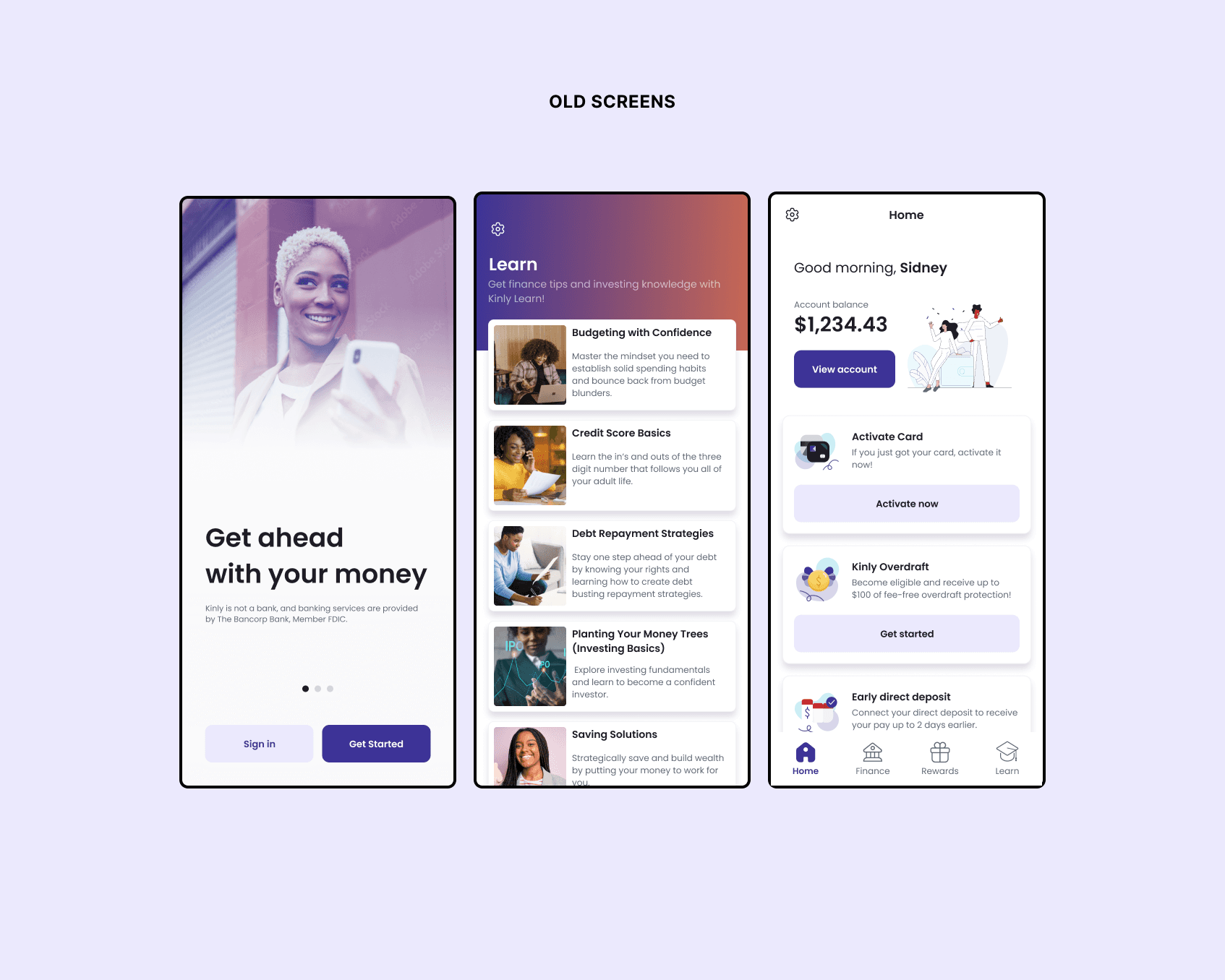
Designed with an broader, more conventional audience in mind, Kinly’s brand missed the mark with the students it was pivoting to serve.
Kinly's original brand was developed by an external marketing agency with a broader audience in mind. It prioritized marketing appeal over usability, lacked accessibility considerations, and surprisingly, wasn’t designed with in-app use cases in mind.
To realign the product with its core users, I led and planned a series of user interviews and cross-functional visioning sessions — bringing in stakeholders from product, engineering, and leadership at every step. This work helped us refocus on a clear goal: helping college students start their financial journeys on the right foot and avoid common pitfalls that disproportionately affect communities of color, like credit issues and limited access to financial education.
User feedback reinforced the need for change. The existing brand was consistently described as dull, disconnected, and lacking the energy students expected from a product built for them.
To ground the rebrand in real user insight, I conducted 50 on-site interviews with college students at the Atlanta University Center.
These conversations gave us a deeper understanding of students' financial habits, frustrations, and emotional responses to money — as well as their impressions of Kinly’s brand. Hearing directly from our core audience made it clear: the product needed to feel not just useful, but culturally relevant, trustworthy, and designed for them.
Recognizing the need for a brand update, I led a cross-functional initiative to redefine Kinly's identity
Strategic Planning
I created a high level project roadmap and assembled a small, focused team that included a freelance brand designer and strategist to bring fresh creative perspective to the work.
Strategic Planning
I created a high level project roadmap and assembled a small, focused team that included a freelance brand designer and strategist to bring fresh creative perspective to the work.
Creative Direction
I collaborated with our brand designer to develop three distinct moodboards, each representing a unique visual direction aligned with Kinly’s mission and audience.
Creative Direction
I collaborated with our brand designer to develop three distinct moodboards, each representing a unique visual direction aligned with Kinly’s mission and audience.
Style Tile Design
I translated each moodboard into a corresponding style tile to explore typography, color, and UI patterns — helping us visualize how each concept could scale across the product.
Style Tile Design
I translated each moodboard into a corresponding style tile to explore typography, color, and UI patterns — helping us visualize how each concept could scale across the product.
Impression Testing
I led impression testing sessions with college students at the Atlanta University Center, using their feedback to refine the brand direction and ensure it felt relevant and engaging.
Impression Testing
I led impression testing sessions with college students at the Atlanta University Center, using their feedback to refine the brand direction and ensure it felt relevant and engaging.
Rollout Strategy
To avoid disrupting our 125,000+ users, I designed a phased implementation plan that introduced the new brand gradually across product touchpoints.
Rollout Strategy
To avoid disrupting our 125,000+ users, I designed a phased implementation plan that introduced the new brand gradually across product touchpoints.
Rollout Strategy
To avoid disrupting our 125,000+ users, I designed a phased implementation plan that introduced the new brand gradually across product touchpoints.
Stakeholder Collaboration
Throughout the process, I facilitated alignment with product, engineering, and leadership teams to ensure buy-in, build momentum, and keep the brand grounded in cross-functional goals.
Stakeholder Collaboration
Throughout the process, I facilitated alignment with product, engineering, and leadership teams to ensure buy-in, build momentum, and keep the brand grounded in cross-functional goals.
Stakeholder Collaboration
Throughout the process, I facilitated alignment with product, engineering, and leadership teams to ensure buy-in, build momentum, and keep the brand grounded in cross-functional goals.
Style Tile Testing & Successful Rollout
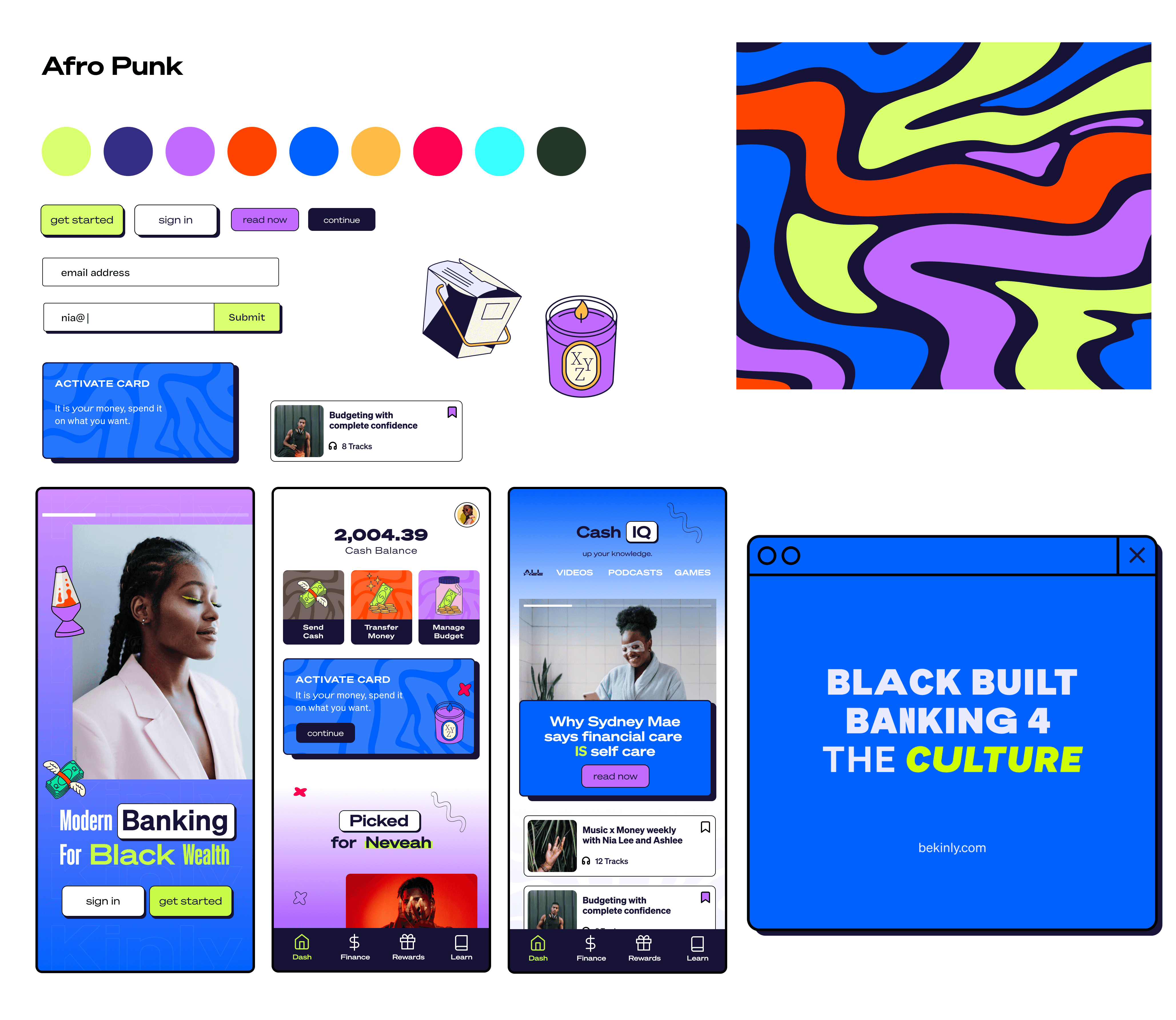
User testing revealed a strong preference for the "Afropunk" concept — a bold, vibrant direction that resonated with students but initially felt too maximalist for everyday use. We refined the concept to strike a balance between energy and clarity, ensuring it remained accessible, scalable, and cohesive across the full user experience.
Logo, color scheme, icons, and business card design developed by the creative team
Design System
As we finalized the new brand direction, I began building out a modular design system to ensure consistency across Kinly’s product ecosystem. I translated the updated visual language into scalable components, color styles, and typography rules, and worked closely with engineering to document implementation guidelines in Figma. The system not only improved design efficiency, but also helped align teams around a shared visual standard — from marketing to product to customer support.
Implementation
To bring the new brand to life, I partnered closely with teams across marketing, product, and engineering to carefully plan a phased rollout. This included updating in-app touchpoints like the sign-out flow, as well as external elements like our metal card design — all aligned to the new visual language without overwhelming our user base.
Results & Reflection
The rebrand didn’t just refresh Kinly’s visual identity — it helped unify the company around a shared purpose and more connected experience.
Over 125,000 users experienced the brand transition with zero disruption, and our testing showed that 90% preferred the new direction over the original. Internally, the design system I built led to a 40% faster UI implementation time and 100% adoption across product and marketing teams.
Together, this work positioned Kinly for scale — and in 2023, it was acquired by Greenwood Bank, expanding its impact and legacy.